How It's Made: Personal Website
16 minute readSep 19, 2025webdev, nextjsTime to talk about how my retro video game-inspired portfolio website was made!
I had a ton of fun building this recently but that wasn't always the case. I started it in 2023 but struggled to find the motivation to continue. I was initially going for a run-of-the-mill corporate-style resume-as-HTML website but it just felt like a slog. That changed earlier this year when I had a 💡 moment and realized it doesn't have to be just a boring website if I built it around something that I like, like retro video games, and that epiphany helped me build it from start to finish in the last 5 months.
I thought it would be fun to look back at all the iterations of the website through the magic of version control and see how it evolved. I'll also share a couple of the techniques and tricks I used.
If you are also a developer, you should probably have a personal website to show off your work too. Your passion doesn't have to be retro games, but I hope this will give you some inspiration to find your own passion and the motivation to start building it.
Inspirations
I grew up in the late 90s and early 2000s and love games from that era - especially GBA, PS1, and PS2. Is it fair to call them "retro" now? Something about their look and feel (the soul, so to speak) is super nostalgic to me, so I wanted to mimic some of their visual elements in my personal website. I had 4 main inspirations:
- Mega Man Battle Network
- Metal Gear Solid
- Pokémon Ruby, Sapphire & Emerald
- Signalis (a 2022 game so not exactly retro but its influences (Resident Evil and Silent Hill) and visuals obviously call back to that era.)
I found myself constantly checking screenshots and videos of these 4 games for inspiration and to try to capture their je ne sais quoi. If you are familiar with these games, I hope you caught a few references on the home page!
I also bookmarked a couple of other personal websites that caught my eye to use as references:
- Dead Simple Sites - lots of great examples here that encouraged me to simplify my design to just the essentials and avoid visual clutter.
- Josh W. Comeau - my holy grail of personal websites. I love the micro-interactions and easter eggs sprinkled all over while still keeping a simple and minimal look. I definitely took some notes from it.
Iterations and Lessons Learned
I checked out some past commits to get a few snapshots of how the website evolved over time. Let's start from the very beginning.
Yes, really. 😅 It was just my name and a link to my GitHub against a black background. This was mostly me getting a domain, setting up a new project in Next.js, and getting something out there as a start.
Still the same content plus a footer, but this was when I established the (original) look and feel. I went for a design that incorporates trendy design patterns like blurs, gradient text and backgrounds, and spring animations. It had a bit of an Apple product marketing page vibe but it didn't really connect with me for my personal website and I didn't expand on it much more.
This was also around when the App Router in Next.js became GA and I migrated to it from the Pages Router which was trivial since I only had a basic layout and one page.
Here I started experimenting with redesigning the look and feel and eventually landed on the retro video game design. It was still just the hero and footer; no content or fancy animations yet.
A big mistake I made at this point was migrating to Vite. My reasoning was that I wouldn't use most features of Next.js that are geared towards full-stack applications with dynamic content since I was just building a static site. What I didn't account for was that I did benefit greatly from Next.js' ability to generate a static export. To explain this a bit better, let's get some acronym soup out of the way.
- Single Page Application (
SPA) - your typical client-side app built with tools like Vite that runs entirely on one HTML page. All of its routing is faked with JS replacing the content of the page. - Static Site Generation (
SSG) - an app with routes that are compiled at build time to static HTML pages. It's supported by frameworks like Next.js, Gatsby, Astro, etc. This is what my website uses. - Server Side Rendering (
SSR) - similar to SSG but routes are compiled at request time. This still has the benefit of producing static HTML, but also allows for dynamic content like a user's name and avatar or user-specific content. It requires a framework like Node.js that runs a server daemon. - Search Engine Optimization (
SEO) - an umbrella term for techniques that improve a website's visibility on search engines like Google.
I said it was a mistake to switch to Vite is because it only supports SPA and those are atrocious for SEO (that's not entirely true and Vite does offer SSR and SSG capabilities but with a low-level API that requires extra tooling and isn't exactly first-class). As a result, I had to use the hash router, and my app's URLs looked like this:
https://shevtsod.com/#/blog
The silly little /#/
made search engines refuse to crawl my website entirely.
💀
That's not to say that Vite is bad and I have used it (and the legacy Create React App) for SPAs, but for a personal website, I definitely needed SSG instead. I ended up migrating back to Next.js which was overall a huge waste of time but a good lesson to learn.
And that brings us to where we are today! 🥳 Once I settled on a tech stack, got the configuration just right (which for some reason always takes the most time), and got a surge of motivation, I was off to the races. From here, it was a dash to the finish line and most of the website was built on weekends from April to August 2025.
The Tech Stack
Here is the tech stack I settled on for the project:
| Name | Purpose |
|---|---|
| Next.js (w/ App Router) | React framework |
| Tailwind | Styling (+ some CSS modules sprinkled in for more complex CSS) |
| Motion | Fancy animations! |
| MDX | Markdown for blog posts like this one |
| giscus | Comments for blog posts powered by GitHub |
| GitHub Actions | Continuous Integration and Delivery |
| GitHub Pages | Hosting the static site |
| Storybook | Testing components in isolation |
So far, this works quite well and covers all my needs! 👍
Design Principles
I religiously followed a few rules I set for myself to guide my design. You may have noticed some examples of these on the website if I did a good job.
- 🎨 Colour and Contrast
- I love chiaroscuro and mixing bold, vibrant colours against dark backgrounds. I think it looks amazing on modern OLED displays. Signalis does this masterfully and my theme is heavily influenced by it.
- ☯️ Alignment, Balance, Negative Space, Proximity, and Repetition
- I try to express the UI without using explicit borders or separators which means bringing similar elements together and keeping dissimilar elements further apart and relying on the negative space between them instead.
- 📱 Responsive & Mobile First
- In 2025, every website should scale to any device size.
- 🕹️ Engaging Content
- Less walls of text and more visuals and interactions to break them up.
- 🦋 Look and Feel
- Establish a theme and stick to it. I built custom components for buttons, icons, form fields, etc. so that nothing feels generic or out of place.
- 😊 Minimalism
- Less is more!
- 🚗 Animation
- Animation is tough because its inclusion helps attract attention and interest but overuse leads to frustration. I took care to use it sparingly and keep animations short and sweet but still noticeable.
Techniques and Tricks
Now I'll deep dive into a few specific features of the website and share some of the techniques I used.
Boot Sequence
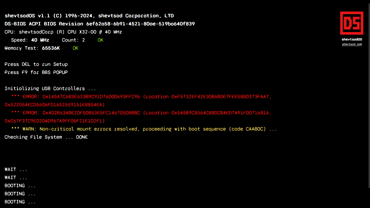
Would I ever force a 2 second splash screen on an actual website or application if it wasn't necessary to cover loading? Never. Would I do it to make a first impression on my personal website? Absolutely!
What was your reaction the first time you saw the boot sequence? I love it because it's so attention grabbing, but I won't lie that I was scared of people clicking off thinking the website is a virus or something. Fast moving terminal text can have that effect. I still kept it because it's a unique touch and fits my theme so well.
I couldn't find a name for this trope (Activation Sequence, Diegetic Interface?) but I noticed games commonly include a fake operating system boot sequence for artistic effect with references to some in-universe brand/company. This shows up in both Signalis and Metal Gear Solid 2. This was the perfect opportunity to introduce my very own shevtsod Corporation and shevtsodOS!
There's a bit of randomization in the time before each line appears that makes it feel a bit more authentic, like it's actually loading. One little detail you may have missed is that the browser tab's title goes through a little boot sequence too. Check it out again at shevtsod.com!
Responsiveness & Dark Mode
Tailwind makes both of these super easy, but I still put in a few extra touches to optimize the experience for each theme and screen size:
- The initial theme is selected based on your operating system setting.
- The selected theme is remembered for subsequent visits.
- When the theme is switched, it fades in smoothly instead of flashing abruptly.
- Certain UI elements (code blocks, transitions between sections, background images for sections) have dedicated light and dark variants.
- Some sections like Contact stay the same across themes where it makes sense.
- Many elements were manually optimized for each breakpoint (e.g., 1 column on mobile, 2 on tablets, 3 on desktop, etc.)
- On larger devices with more space, the table of contents in blog posts gets pinned to the side.
I have another blog post that goes into detail about how to implement dark mode in Next.js and gotchas.
Orchestrating Animations
There's not much to this really; I just used basic CSS keyframe animations and some magic numbers to queue animations like those in the Hero.
.title.intro {
  animation-name: fade, titleShine;
  animation-duration: 2.5s, 10s;
  animation-timing-function: steps(4, end), steps(60, end);
  animation-delay: 1s, 6s;
  animation-iteration-count: 1, infinite;
  animation-direction: normal, normal;
  animation-fill-mode: both, forwards;
}

.chevron.intro {
  animation-name: fade, blink;
  animation-duration: 1s, 2s;
  animation-timing-function: steps(1, end), steps(1, end);
  animation-delay: 6s, 7s;
  animation-direction: normal, normal;
  animation-fill-mode: backwards, none;
  animation-iteration-count: 1, infinite;
}
I also added styles based on component state in a few places for some more control. Shoutout to classnames for making conditional styling so easy!
import styles from './hero.module.css';

export default function Hero () {
  const intro = useIntro();

  return (
    <h1
      className={classNames(
        'text-[6em]',
        // add title class from hero.module.css
        styles.title,
        // add intro class only if intro mode is enabled
        { [styles.intro]: intro },
      )}
    >
      Daniel Shevtsov
    </h1>
  )
}
If I did have any animations that are more complex, I would just use a library like Anime.js to truly orchestrate them. You can do a lot without any libraries with just basic CSS, though, so why add another dependency?
It was also very important to me to not bombard the user with animations. I wanted to keep the Boot Sequence for the reasons mentioned in that sections, but I also didn't want users to have to go through it more than once. I called this the "intro mode" and wanted to have a way to toggle it on and off.
Since my app uses SSG, every page is actually a different HTML page. It's a bit tricky to maintain state across pages, but a really easy option is to just use the URL. I simply check if there is a hash in the URL to disable the intro mode. With the intro mode off, most transition animations are skipped.
- https://shevtsod.com ⬅️ intro animation plays
- https://shevtsod.com#top ⬅️ skips intro animation
This is why you only see the Boot Sequence once, and when you click Home or Contact in the Header, you don't see it again. It also gets skipped in the blog, so if you opened this blog post from a link, you wouldn't see the Boot Sequence either.
The rest of the animations are just the fade-into-view kind that you've seen
everywhere. I implemented these using the
useInView hook which is a wrapper
for
IntersectionObserver
with a nicer API for React.
Simulating Low Framerate
Retro games ran on very limited hardware (and some developers used dark magic to make them run in the first place). Most consoles like the PS1 and PS2 ran at low framerates like at 30 frames per second (FPS). As a result, you got choppy/stuttery animations that became associated with games of that era.
I wanted to replicate this in my website, but funnily enough, with modern hardware and high refresh-rate monitors, you have to go out of your way and actually put effort into making animations look choppy on purpose.
Meet my best friend, the
steps()
timing function.

steps() function descendssteps() lets us "control" the smoothness or choppiness of the animation. To
put it another way, if we have an animation that runs for 1 second and we use
steps(30, end), we are essentially simulating that animation running at 30
FPS. The diagram below illustrates the difference between steps() and other
timing functions like linear.
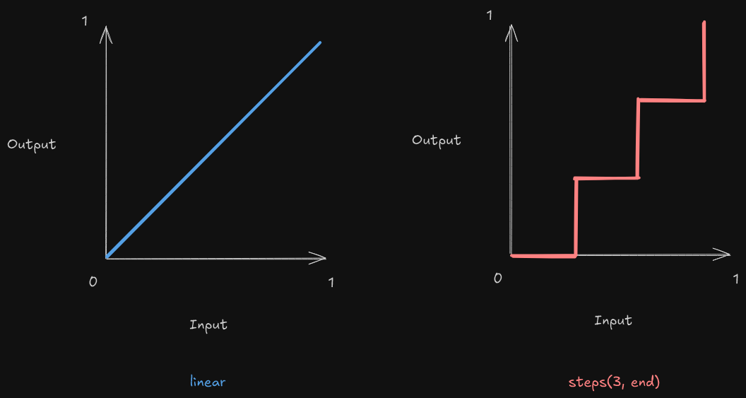
linear vs steps timing functionsHere's a practical example:
The NORMAL circle objectively has better animation, but imagine how out of
place a buttery smooth 60+ FPS animation looks against some pixel art. On the
other hand, a steps() transition looks a lot more immersive. It's kinda like
how movie directors refuse to shoot above 24 FPS and despise motion
interpolation in modern TVs.
I used steps() all over the place but strategically kept some animations (like
Skills & Experience) running at high FPS because I found
that if everything looks like it's animating slowly, it feels like the page
itself is running slowly.
Header

The header is the primary form of navigation and contains the most critical links and buttons. It supports two modes - It can either be shown/hidden after crossing a scroll threshold or it can always be fixed to the top of the page, and this is controllable per page. I hide it by default on the home page to put the Hero center stage.
The logo is actually animated! Look at it for a few seconds and it should do a cool flip.
In the spirit of retro games, the logo animations come from the sprite sheet
above. This was a fun coincidence because storing images in sprite sheets also
happens to be a classic optimization for network bandwidth in web development.
My Logo component uses the finite-state machine (FSM) below to transition
between the three different animations contained in this sprite sheet and slides
through the frames to play each animation.
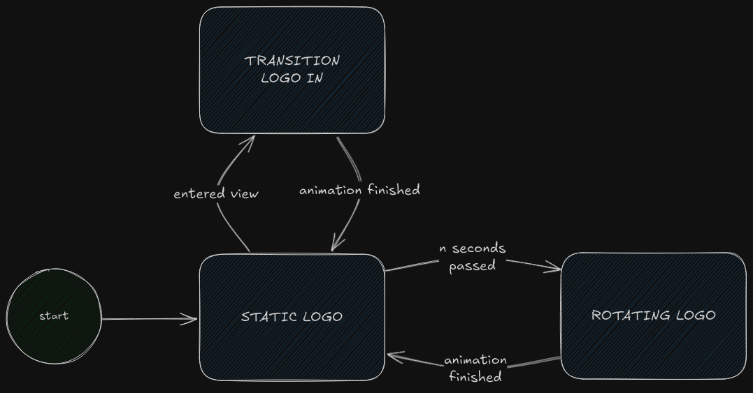
Home
Hero
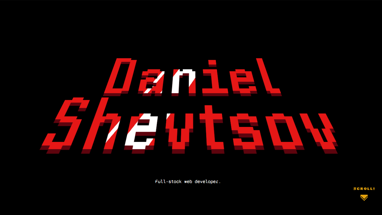
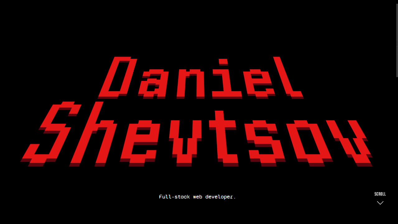
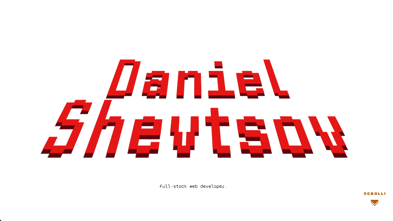
The hero section - the big, bold welcome screen at the top of a website whose only job is to make an impact. First impressions are everything! This one is a reference to title drops in many retro games. Specifically, mine is inspired by the opening intro of Pokémon Ruby, Sapphire & Emerald.
The subtle 3D text effect and the shine rolling over it made me really want to recreate it, and this section was the perfect fit. I did tone down the flashing colours a bit - Pokémon has some history with that.
The effect is really simple - it's just a combination of
transform: perspective() for the 3D effect and a very specific
background: linear-gradient() for that sharp glossy shine.
Oh, and that little SCROLL! is inspired by the GO! indicator in beat'em ups
when you clear a room. 😄
Summary
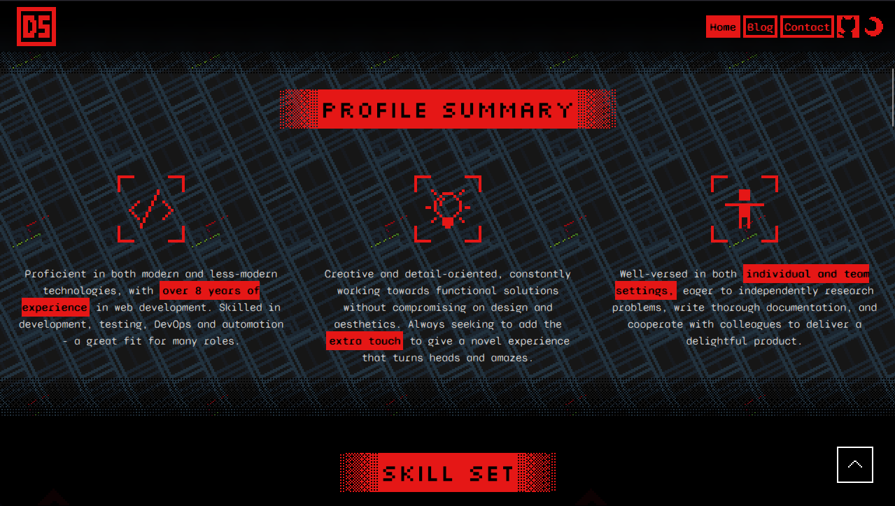
This section is just a (hopefully accurate) summary of myself in three bullet points.
The background is pixel art that I made inspired by Mega Man Battle Network.
Its overworld and battles had these repeating, scrolling backgrounds reminiscent
of clip art on websites in the 90s. I used the
useScroll() hook to give it a bit
of a parallax effect so it looks like it's further back on the page and it
starts scrolling the other way when you scroll up.
Skills & Experience
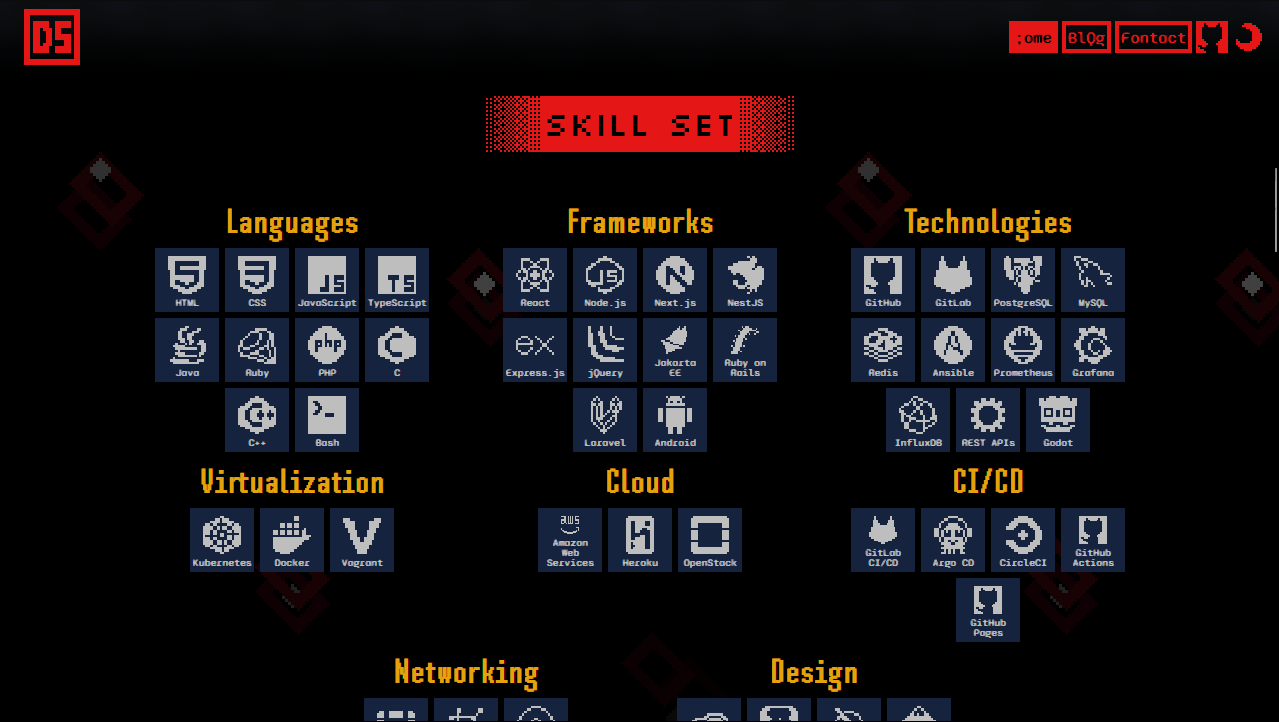
After the Summary, we go into a bit more detail with my resume. The skills are displayed in responsive grids, and my work experience is displayed as a timeline which I think is just intuitive.
All of the icons are pixel art handcrafted by yours truly!
Projects
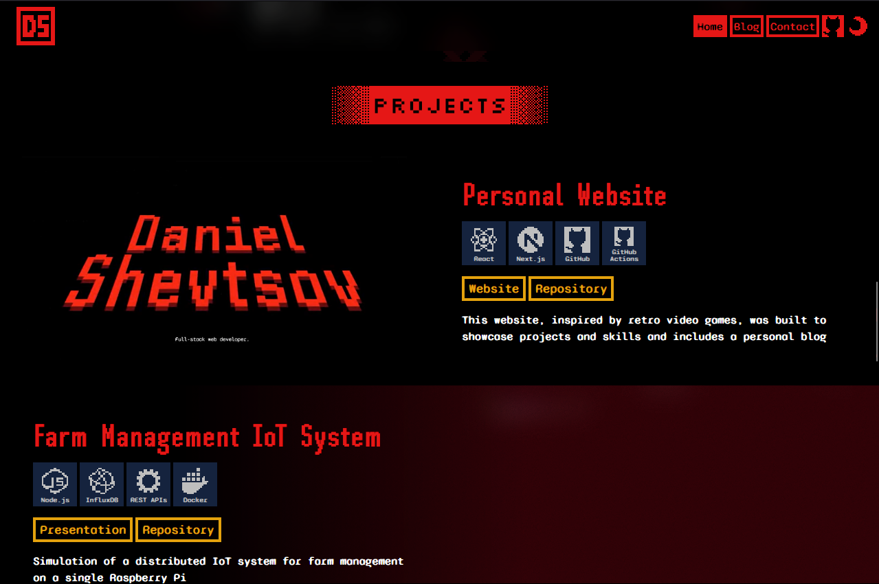
My favourite section! It feels like a display window of my highlighted projects with a large video/image demo for each. For just this section, I removed the side margins to give the previews maximum screen real estate. I have a frosted glass effect covering all but the closest project to the center of the screen to draw focus to one of them at a time.
One thing I forgot to mention is that the actual content in this section (and the previous sections) is not hardcoded in the components but stored in config files, so I can easily update them later in my career without digging into the code.
const projects: ProjectType[] = [
  {
    title: 'Personal Website',
    description:
      'This website, inspired by retro video games, was built to showcase projects and skills and includes a personal blog',
    promo: {
      path: '/videos/projects/480p/personal-website.mp4',
      type: 'video',
    },
    skills: ['nextjs', 'react', 'github', 'github-actions'],
    links: [
      {
        key: 'website',
        url: 'https://shevtsod.com',
      },
      {
        key: 'repository',
        url: 'https://github.com/shevtsod/shevtsod.github.io',
      },
    ],
  },
  // ...
];
Contact
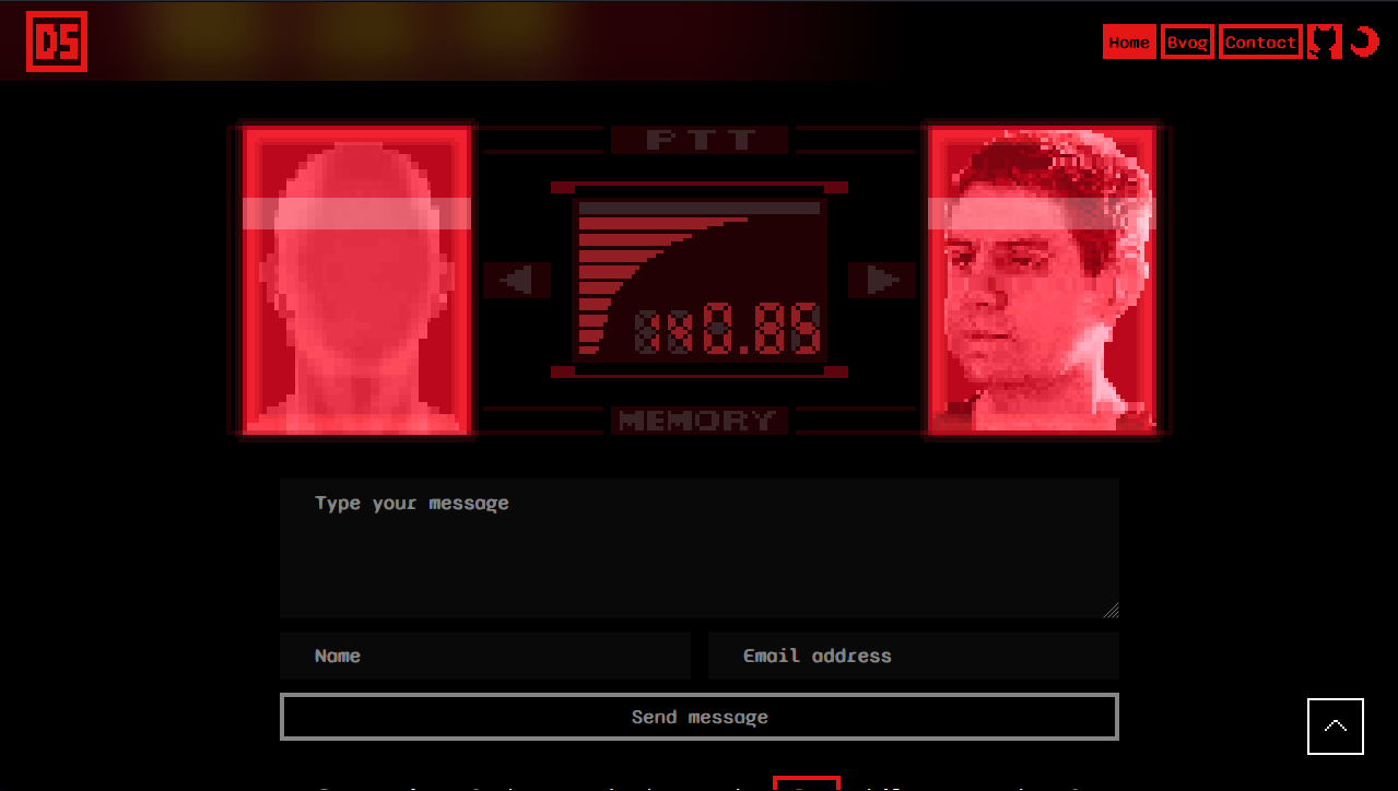
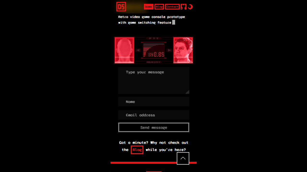
A thinly veiled contact form! I hope it's obvious that this one is straight out of Metal Gear Solid. I just recreated the iconic codec call interface but with my own theme colours and replaced Snake and the colonel with my own mug and your mysterious anonymous face. A few carefully timed CSS animations let me show the "CALL" notification and a quick call to action that looks like a message from me to you.
Blog
I wanted to have my very own blog for a long time, and I finally get to have
one! It's powered by MDX and I find it extremely
powerful to be able to write blog posts (like this one!) in the lightweight
Markdown syntax but still have the flexibility to insert any custom JSX
including any React component. I don't think I'd have this much freedom on any
other existing platform.
A few of my favourite features of the blog are:
-
the reading progress bar that gets added to the header.
-
the ability to embed just about any content and make it look perfect.
-
using frontmatter to set blog post metadata, set a hero image, and publish posts.
blog-post.mdx--- title: "How It's Made: Personal Website" description: 'A meta blog post on the making of my personal website, inspirations, techniques, and the iterations along the way.' author: 'shevtsod' created: '2025-09-19' updated: tags: 'webdev,nextjs' imageUrl: '/images/blog/250919-how-its-made-personal-website/hero.png' published: true --- -
code blocks like the one above that were a perfect chance to re-use my pixelated skills icons!
Next Steps
It's never perfect and I'm always making little tweaks, but a couple of larger features I'd like to add at some point include:
- an RSS feed and a sitemap.
- search/filter blog posts by tags.
- a more sophisticated image component with a "maximize" button.
- dive into Three.js and add some low-poly PS1-era 3D graphics.
And that's it! Thanks for stopping by, and let me know your thoughts in the comments below.